2012-2015
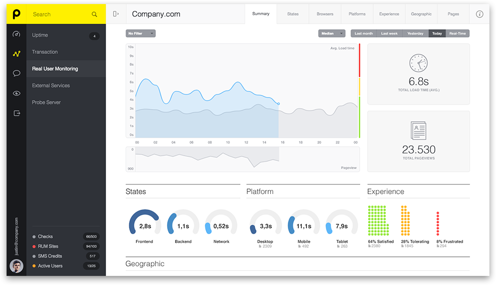
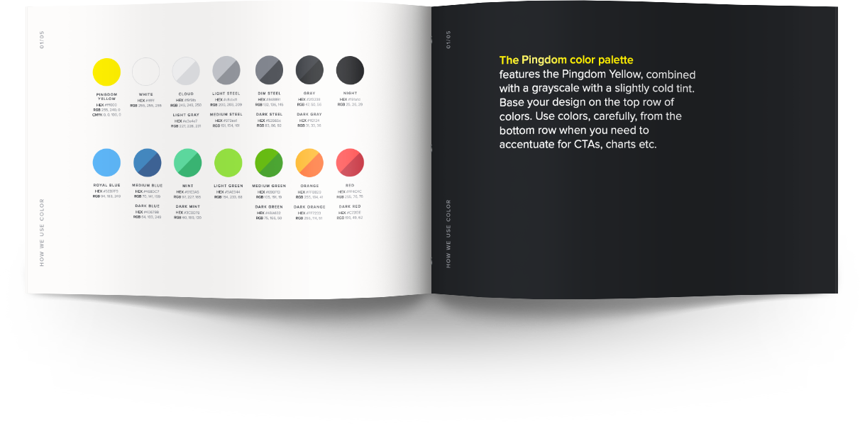
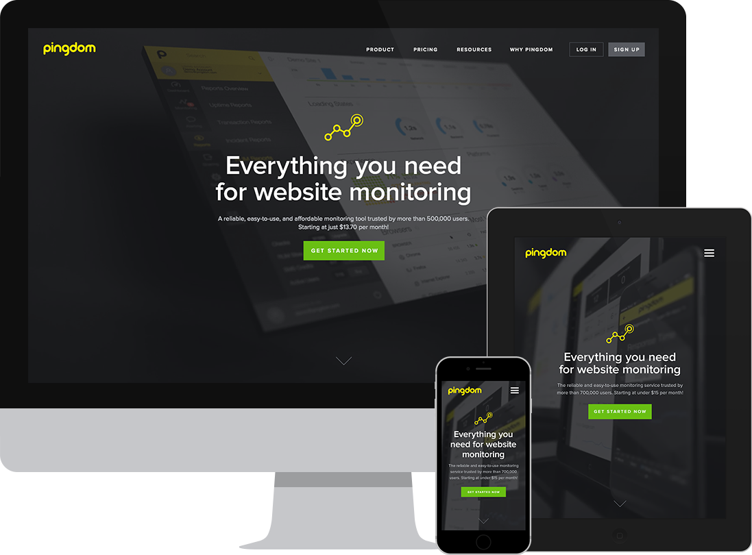
I worked as Lead Designer at Pingdom, a Swedish Software-as-a-Service company. My first years were spent mainly as a Product Designer. I was in charge of a complete visual overhaul of the product and to establish a consistent design language. When Pingdom expanded to its second location, I transitioned to help the company establish a design team with a marketing focus.
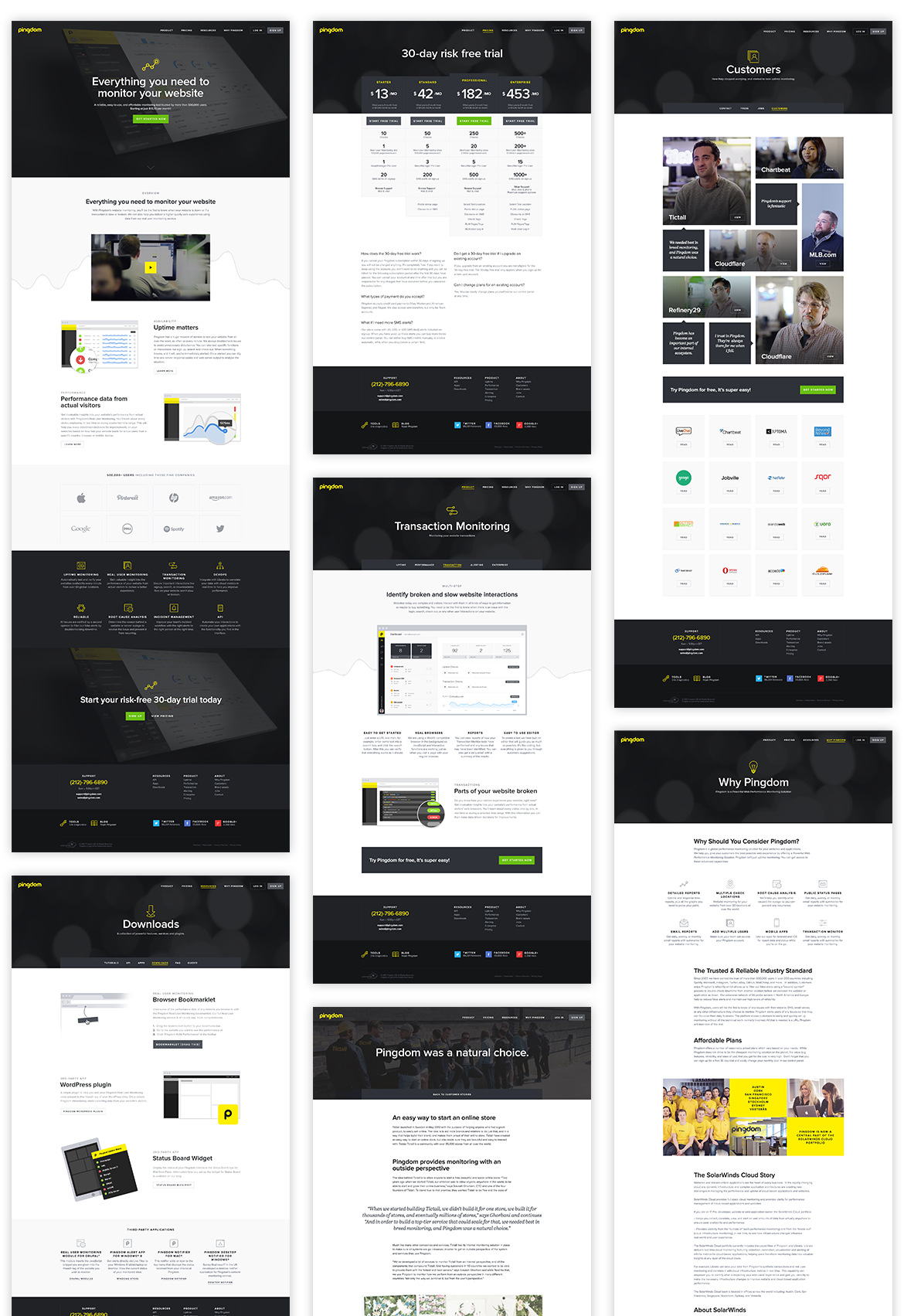
Modular Approach
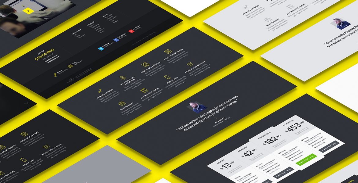
Using several different color schemes that could be applied to any module made it easier to switch around parts of a page without disturbing the rhythm in color and contrast. This also made A/B testing a lot smoother. With a tight timeframe to redesign the whole site, finding flexible and reusable design patterns were even more important. Thinking in modules was a great way for us to stay lean and unified.
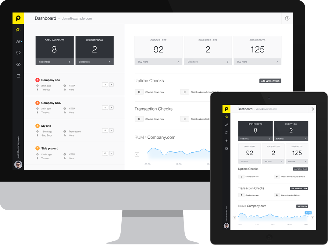
User Interface
When I arrived at Pingdom, they were in the midst of growing their reach and cater to both smaller businesses, as well as more advanced enterprise level customers. The interface had to accommodate for new tools (such as Real User Monitoring & Multi User Accounts) which led to a major redesign of both the architecture and look-and-feel.
